Everyone knows it – everyone uses it: the level-time diagram.
But why is the diagram so popular? We would like to introduce you to the 3 most important advantages and show you why the level-time diagram is indispensable in energy data management.

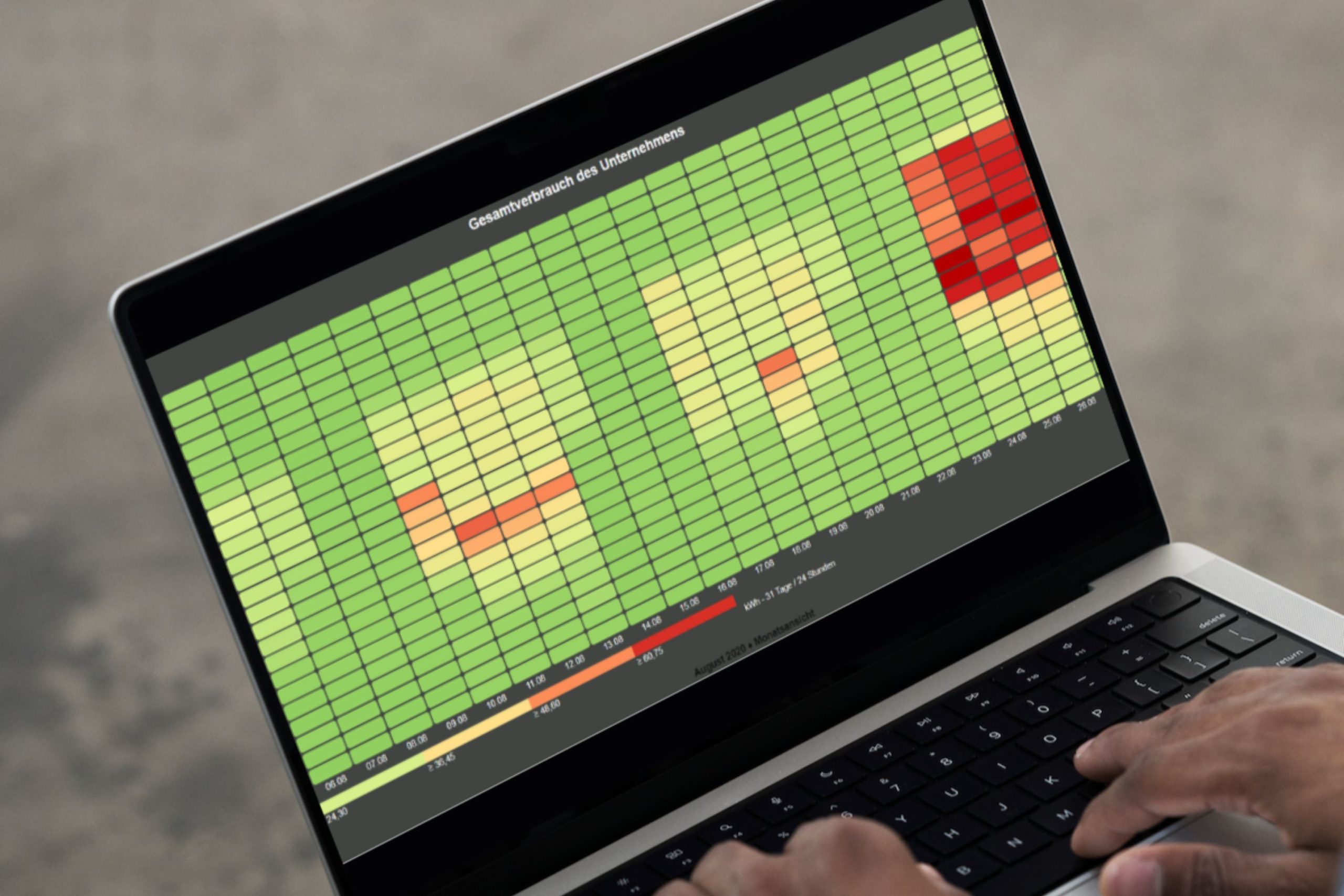
Level-time diagram with gas and temperature values
Briefly explained: what is a level-time diagram?
As the name suggests, a level-time diagram shows a level on the vertical Y-axis over time on the horizontal X-axis. It does not matter whether you want to display an electricity feed-in, gas consumption or the measured water quantity as a level. The base load and peak values are immediately recognizable for all media. Its popularity is due on the one hand to its simple control and handling, and on the other to the quick overview it provides, for example, of a load profile.
But what other functions and options does a level-time diagram offer to make it an indispensable tool? We will go into this in detail below.
1) Comparable – Different media in one diagram
An energy data management system – EDM for short – is often only used to analyze electrical energy, i.e. electricity and power. But an EDM such as visual energy can do much more: it can record and analyze all media that are relevant in terms of energy efficiency. visual energy 5 offers electricity, heating and cooling, gas, hot and cold water, oil, compressed air, temperature, nitrogen, vehicles and other customizable media. This is also necessary, as the combined analysis of different media makes it possible to quickly draw new conclusions and identify potential savings.
Practical tip! Creation of a level-time diagram in visual energy 5:
In the evaluation area under Documents, click on the + button to create a level-time diagram. Use another + button (1 ) to add channels or metering points. Select the desired location (2) in the open selection window . You now have the option of limiting the selection to a specific medium (3). All media assigned to the location are displayed here, which in turn makes the search easier. Adding to the diagram is the same for all counting points, regardless of which medium is involved. If there are a large number of meter points, the search function (4) helps you to find meter points quickly.

Explanation: Creating a level-time diagram with different media
2) Clear – Graphic highlighting of metering points
We use other functions to edit the level-time diagram to make it clearer. Various selection options are available, including color, rank, auxiliary lines, axis adjustment, chart type and value grouping.
First, we change the color of our displayed values. It makes sense to adjust the color depending on the context or number of counting points, especially if there are several counting points. This makes it easier to assign the corresponding values later.
We use the rank to determine which values are displayed in the foreground (low rank) or in the background (high rank). Values that would otherwise overlap remain clearly recognizable.

Level-time diagram with different media – outdoor temperature in °C, heat pump in kWh and gas boiler in m³
In addition, you can add the minimum, maximum and average value of the selected period per meter point/channel as a statistical auxiliary line, which is particularly useful for load curves.
There is also the option of adjusting the Y-axis. To begin with, we recommend leaving the automatic setting unchanged. If you are already familiar with the diagram, you can choose between 4 other representations. If you select 1 for the channel, the unit is displayed on the left-hand Y-axis. Setting to 2 points to the right Y-axis. Setting to 3 points to a further, separate left-hand Y-axis and to 4 points to a further right-hand axis.
When setting the type, you can choose between bars, lines and points. For example, we display the temperature in a line. The width of this line can of course be changed and displayed as a continuous, dashed or dashed and dotted line. In order to illustrate direct daily differences, the line can also be displayed in steps.
In addition to the many graphical options, you can easily quantify the extreme values in particular with a user-definable number of decimal places. The simple grouping of values enables a better comparison, e.g. from week to week, as the values are no longer only displayed quarterly, but daily, weekly, monthly or annually. You can also select the minimum, maximum or average values.
3) Variable – More than just a diagram
A level-time diagram in visual energy 5 is more than just a simple diagram. In the control bar, you have the option of converting the diagram into a value list, a table or a frequency distribution in the Display area. While the value list shows all quarter-hour values for the selected period in chronological order, the frequency distribution shows the values by size. This allows you to immediately recognize which value ranges occur in which number and whether there are direct correlations.

Level-time diagram Navigation bar
You can also change the time range displayed in the navigation bar. With just one click you can jump to another month or another year for your values. The grey background color shows which area is currently being output. An over-mouse text tells us immediately that we are in the month view when we select 31 or in the week view when we select 7. If we now jump to a new time range using the navigation arrows, it may be necessary to reload data for the current range, depending on the previous setting.
We hope you enjoy implementing your level-time diagram.
Your visual energy Team