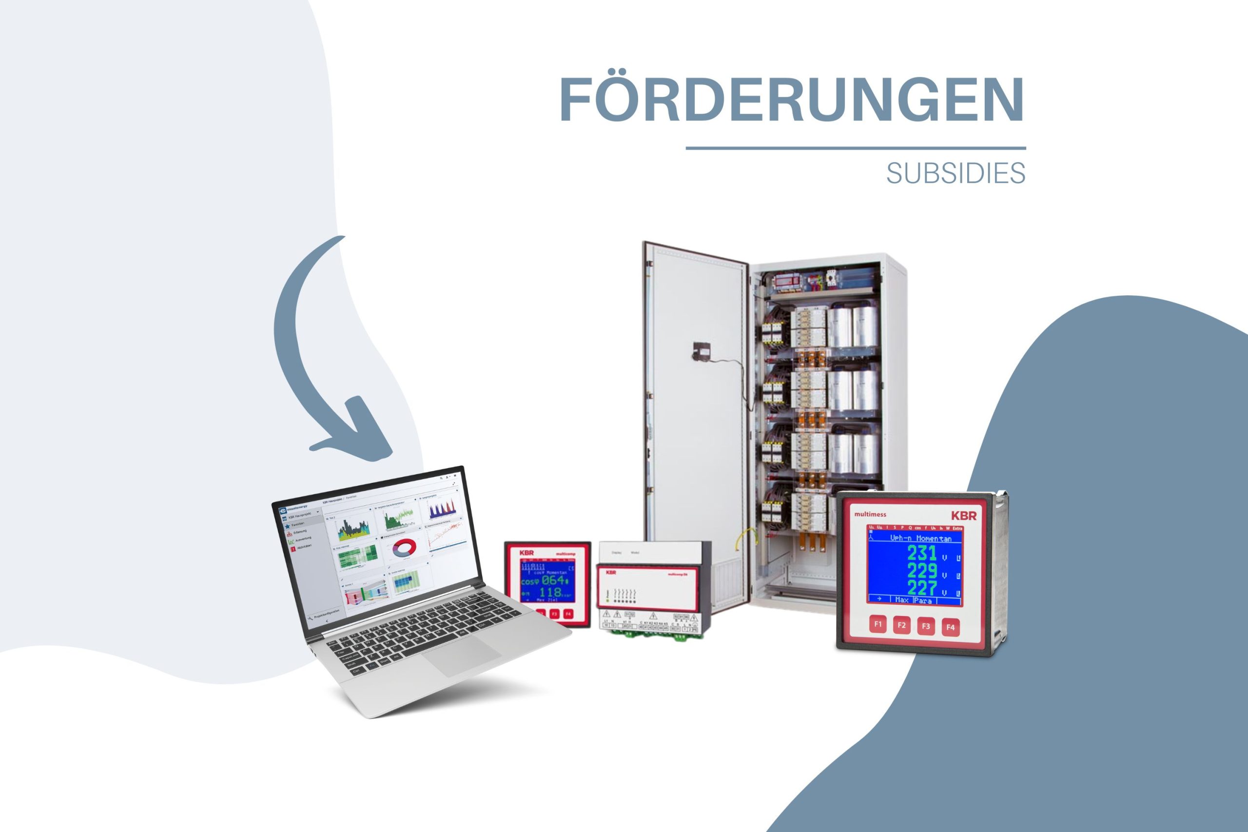
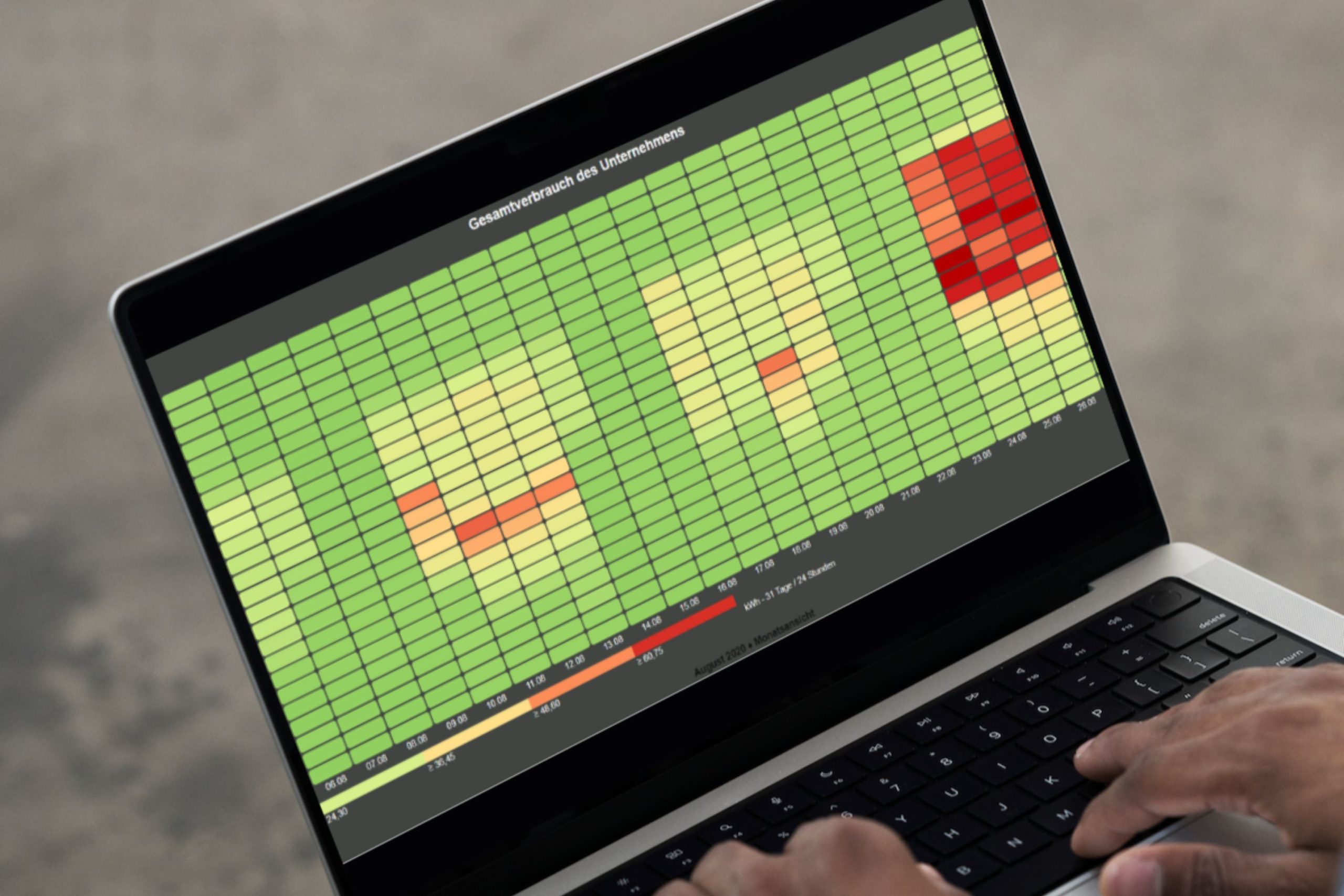
Maintain an overview: Visualize large amounts of data using heat maps.
If a large amount of data is available, it is usually difficult to present it clearly and concisely using standard graphics. visual energy 5 now also offers you the right solution for this. In a matter of seconds, you receive the corresponding heat map for each desired key figure.
You can use this heat map to visualize and analyze a large amount of data. Particularly conspicuous values are highlighted in color so that weak points and the need for optimization can be quickly identified. Of course, this function also allows you to individually define all chart properties, such as color scheme, axis scaling or time range.
Let me show you how you can create a heatmap in no time:
In the Evaluations area, select a suitable storage folder and then click on the ![]() the “Heatmap” menu item:
the “Heatmap” menu item:

Once you have entered a suitable name for the heat map, the diagram map opens and an empty heat map awaits your input. Now you can add any channel again using the plus button. By channel in this context we mean a metering point (real / calculated / key figure /…) and the associated OBIS measured variable. The meter point selection dialog enables a project-wide search. However, only elements for which the logged-in user has at least read authorization are listed.

Of course, typical features such as color and lettering can also be adapted to requirements at any time. The connections can then also be added or subtracted in the channel properties.

Finally, a view of the result. You can now switch between evaluation periods as required and examine the changes. If you like the result, all you have to do is press a button and the heat map is available in its full glory as a PDF.

Your visual energy Team