The new features of visual energy are more comprehensive than ever: that’s why we are launching the blog series “visual energy5 in detail”. In each issue, we report on a new feature in visual energy5.
It all starts with the revised Sankey diagram:
The Sankey diagram is indispensable, especially for energy flow diagrams. The ability to display inflows and outflows with all intermediate steps is not only the attraction, but also the real challenge for the tool. In version 4, we already had a static Sankey representation available based on the distribution scheme. Static because the channels were fixed due to the inlets and outlets of the distribution system. Only the time period could be changed by the user.
For version 5, we therefore decided that we wanted to provide a completely freely definable Sankey. Each channel, each color, etc. should be freely definable. In the end, we succeeded very well. But let’s go through the whole thing step by step:
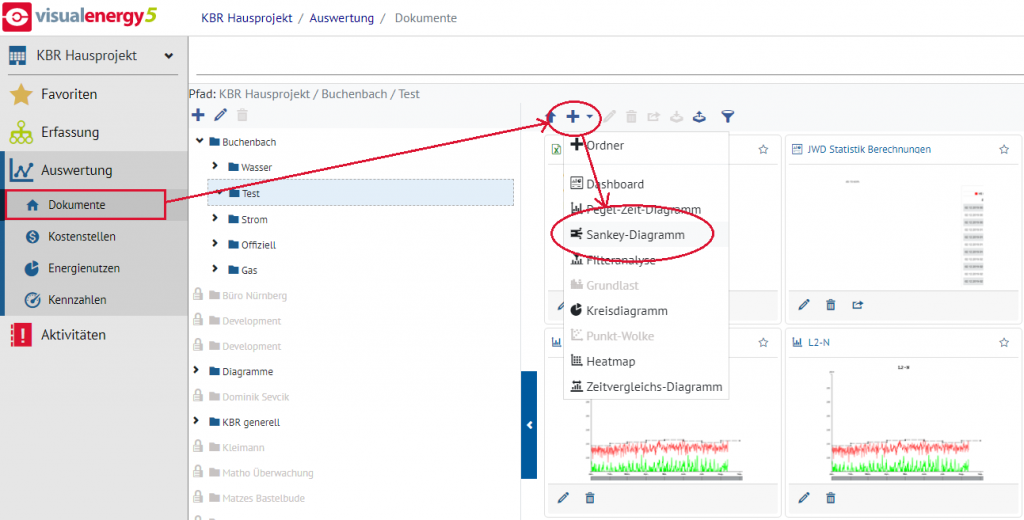
In the Evaluations area, select a suitable storage folder and then click on the the menu item “Sankey diagram”:
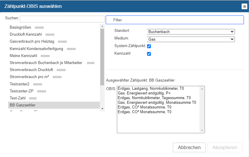
Once you have entered a suitable name for the diagram, the diagram map opens and an empty Sankey is waiting for your input. Now you can add any channel again using the plus button. By channel in this context we mean a metering point (real / calculated / key figure /…) and the associated OBIS measured variable. The meter point selection dialog enables a project-wide search. However, only elements for which the logged-in user has at least read authorization are listed.
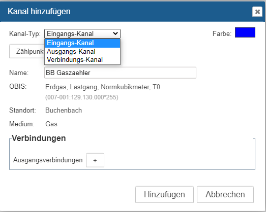
Each added channel can be configured either as an input, output or connection channel:
Of course, typical features such as color and lettering can be adapted to requirements at any time, even retrospectively. The connections between input, output and intermediate channels can then also be defined in the channel properties. However, the automatic calculation of an intermediate node based on entries and exits is also planned. With all these options, it is quite clear that the creator is responsible for the plausibility. It may be desirable to process different forms of energy and measured variables in one diagram. It is up to the processor to decide whether this makes technical sense.
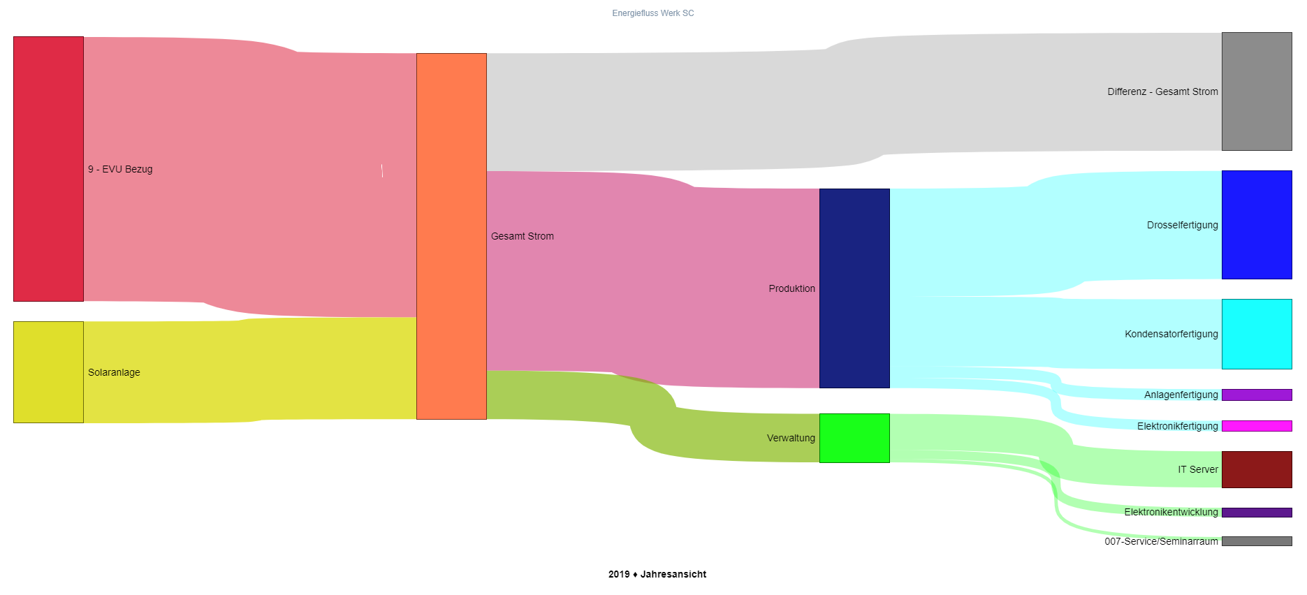
Finally, a view of the result. You can now switch between evaluation periods as required and examine the changes. If you like the result, all you have to do is press a button and the diagram is available in its full glory as a PDF.
Your visual energy Team
